Microsoft M365 Try Page
The Constraint That Created the Opportunity. Users who wanted to try Microsoft M365 had two chances to say yes — one at the top of the page, one at the bottom. Everything in between was a gap where intent could go cold.

During my time on the Microsoft e-commerce team, I worked on improving the M365 Try page. This was the entry point for users considering a free trial before committing to a Personal, Family, or Enterprise subscription.
The page had two CTAs — one at the top, one at the bottom. A user who scrolled past the first CTA without acting and exited before reaching the end of the page had no further opportunity to convert.
Hypothesis: If users could access a sign-up option throughout their scrolling journey, then more of them would take it.
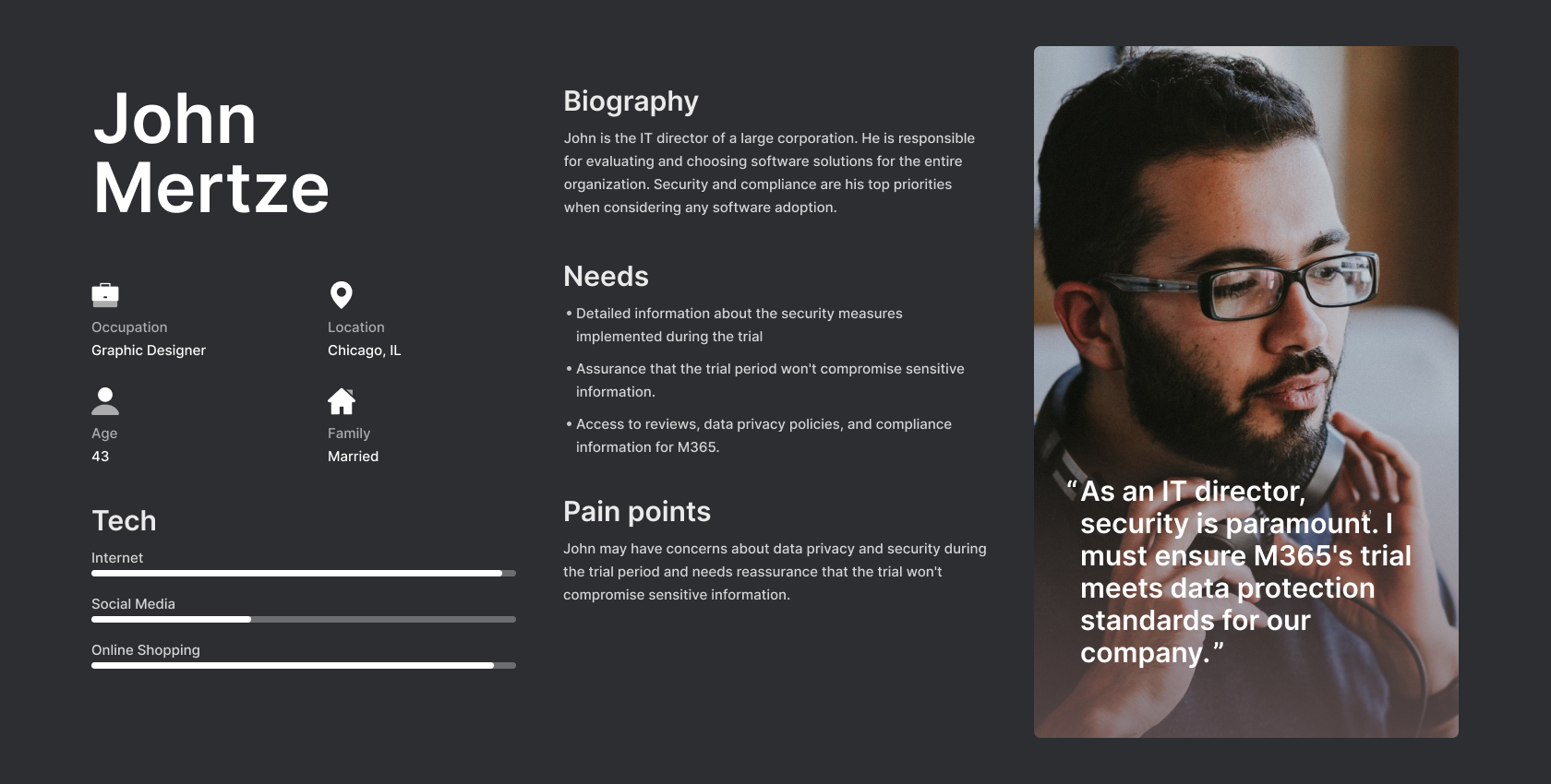
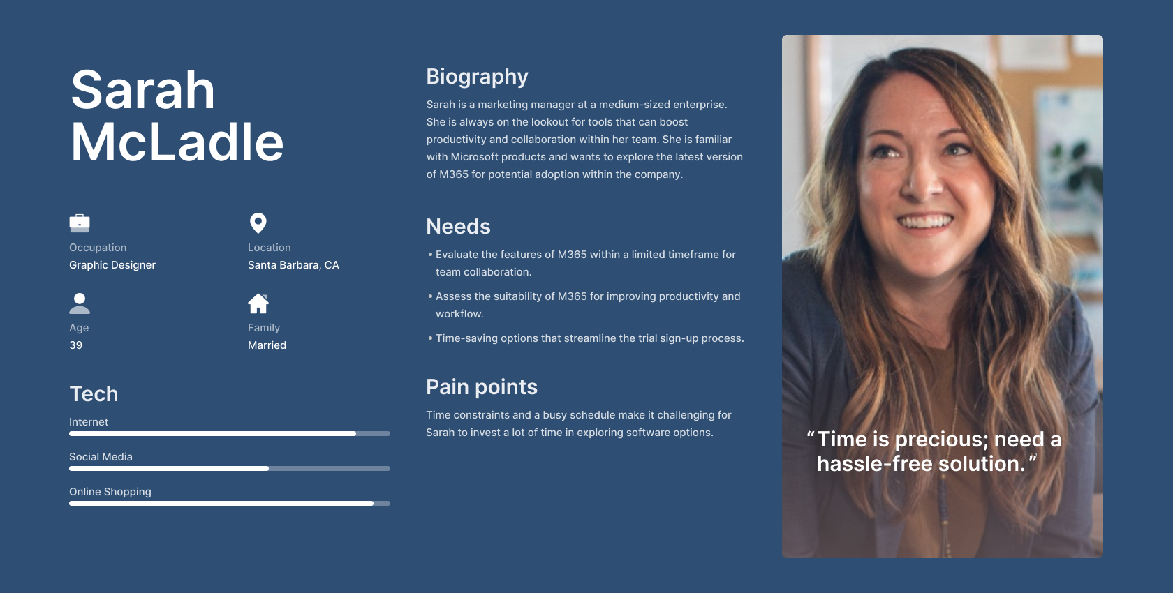
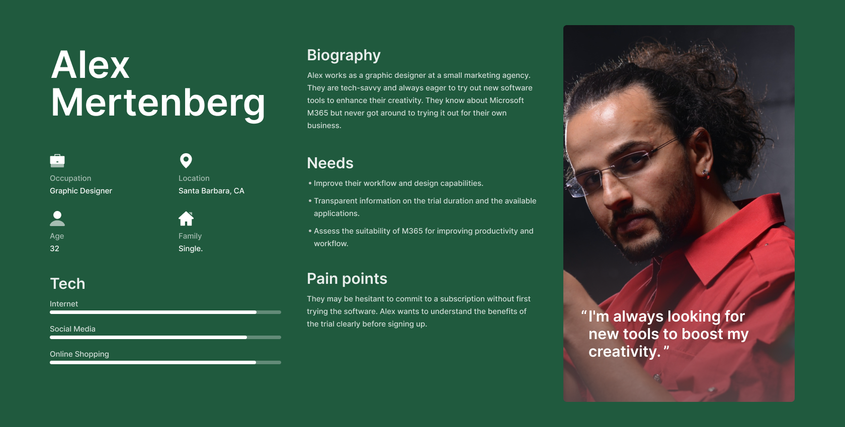
Three personas shaped the design direction: a creative professional exploring tools to improve workflow, a marketing manager needing a frictionless sign-up to evaluate M365 for her team, and an IT director prioritising data security who needed transparency before committing.
Across all three personas, the goal was to evaluate the product and move forward with confidence.
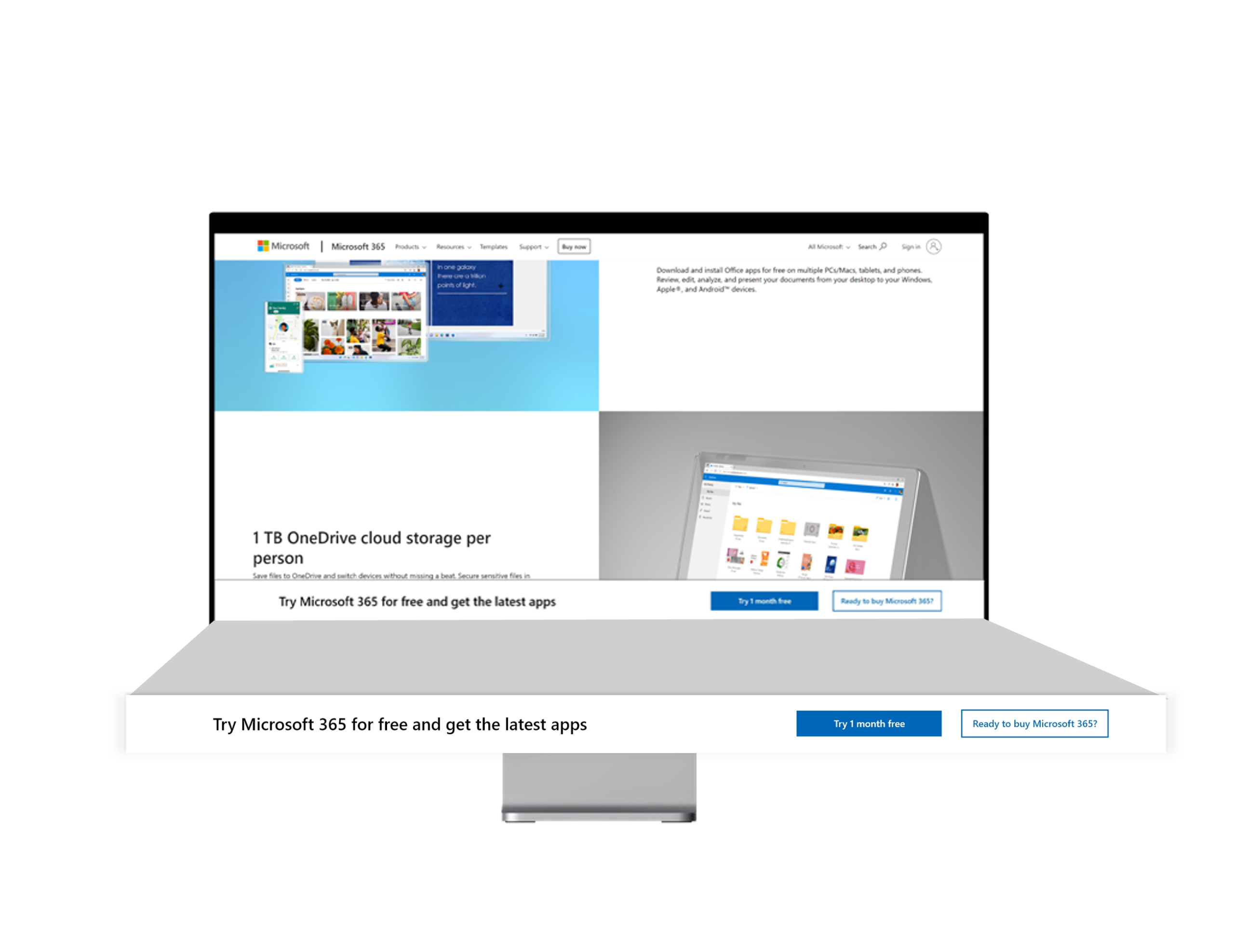
I designed a sticky bar fixed to the bottom of the browser window, distinct from the navigation, and placed it closer to where the cursor naturally travels during scrolling.
Copy was developed collaboratively through multiple stakeholder review sessions, landing on: "Try Microsoft M365 for free and get the latest apps." This communicated a free and clear benefit, enticing new users to a 1-month trial throughout their scrolling journey. CTA color was standardised to match the primary blue used throughout the page.

The experiment produced a measurable lift in conversion. Based on these results, the variation was recommended for publication and further iteration.
Given continued access to the page I would want to test CTA placement within the sticky bar, explore alternative copy framings, and run colour experiments to understand how the component performs across different contexts. The results suggest this pattern could be applied to other pages in the M365 funnel — but each would need its own experiment to validate the assumption.