Mobile UX Redesign
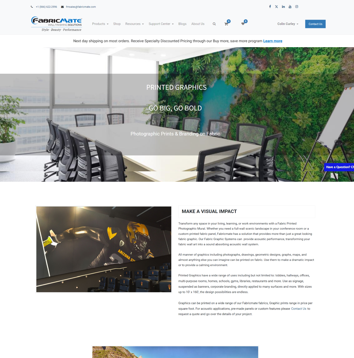
Fabricmate Systems has manufactured premium stretched fabric wall systems in Ventura, California since 1989. Their buyers, including architects, designers, facility managers, and contractors, mainly purchase through a direct e-commerce site. The site was built primarily for desktop and the product pages weren't built to serve a mobile user. In a world where consumers prioritize the convenience of online purchases through mobile phones, Fabricmate Systems was being left behind.
The buyers most likely to purchase Fabricmate's products were field-based professionals researching materials between job sites and client calls. Prioritizing the mobile experience was a clear opportunity to better serve that audience and drive measurable growth in site activity and inbound leads.


To understand the scope of the problem, I conducted a heuristic audit of eight core pages evaluated against mobile usability criteria including:
1. Viewport behavior at 375px
2. CTA visibility
3. Image load hierarchy
4. Content legibility on small screens
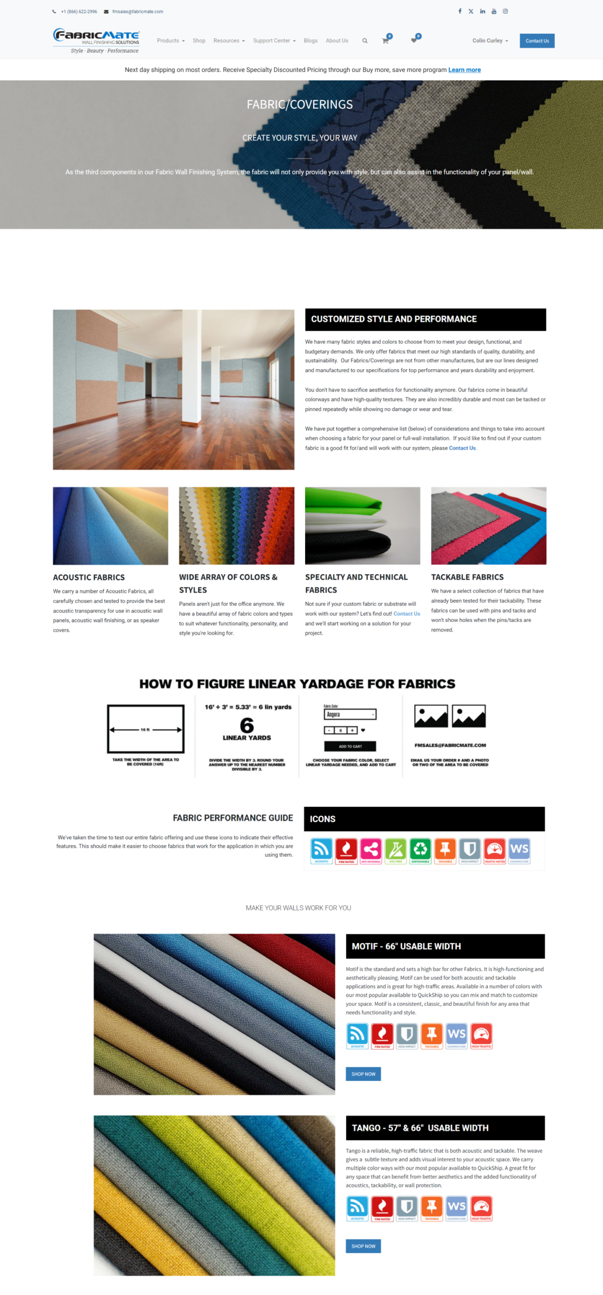
Multi-column grids collapsed into unreadable stacks on mobile. Navigation required precise tapping on elements too small for a thumb.
The mobile layout broke down at every level. Multi-column grids collapsed into unreadable stacks. Navigation required precise tapping on elements too small for a thumb. Images loaded at full desktop resolution, slowing the experience for users on cellular connections.
The product category pages, intended to educate customers on specific product types, were less than ideal on mobile. Dense text blocks and horizontal comparison layouts translated poorly to small screens, leaving users without the information they needed to move forward.
The Custom Graphics Order Form presented the steepest drop-off risk. A required field carried no helper text and the minimum file resolution requirement was buried on a separate page. The submit button sat below the fold on mobile, rendering it invisible unless the user already knew to scroll for it.
With the audit findings, I developed wireframes for each tier of fixes and presented them to stakeholders for approval. Once aligned, I led the production of website media, oversaw quality control, and executed the final web design end-to-end.
The redesign introduced single-column scroll patterns across all product pages, sticky CTAs visible at every point in the journey, and inline guidance throughout the order form.
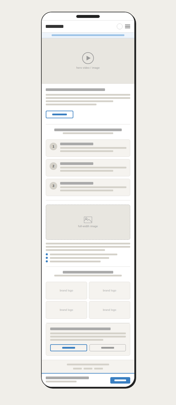
Single-column scroll patterns were introduced across all product pages, with sticky CTAs visible at every point in the journey and inline guidance throughout the order form.


Contact form submissions increased significantly, a direct indicator of prospective leads moving further through the funnel. The redesign demonstrated that closing the gap between desktop and mobile UX isn't just a usability improvement but also a measurable business decision.